Naturally, when I woke up this morning I wondered what it meant. What deep and mysterious truths and occurrences did this dream foreshadow? If I go out thrifting today will I actually run-across the ruddy-colored compatriots of my turquoise motherlode?
Then I took a look around:


 Turns out I have a lot of frickin' orange laying around the house. And that doesn't even include the awesome tangerine spring day-coat I snagged for half-off (!) at a vintage clothing-store the other day. The strange thing about all this, though, is that up until very recently orange was perhaps one of my least favorite colors. Right up there with pepto-bismal pink and princess purple (rendered exponentially hideous when used together). Orange things I liked included: oranges. pumpkins. cheddar. monarch butterflies. That, my friends, is not a very long list. And it certainly doesn't include snack bowls, and tea-towels, and coffee cups, canisters and clothing. What happened?!
It would be all too easy to say I have merely fallen victim to Pantone's Color of the Year, which is, in fact, a bright, terra-cotta-esque "tangerine tango." But that would imply I have the ability to keep up with trends, which a look inside my closest clearly indicates that I do not (unless navy blue, cream, and grey cardigans are coming back in fashion. Please please please!). No, I blame it on these:
 Well, the top two anyway. We had discovered a new estate warehouse that offered online bid-auctions as well as in-person sales once monthly. So a cold, brisk winter morning we lined up outside the opening and as the door opened, I saw these. Can we say, "bee-line?" Both the flame pieces are Le Creuset, the sunny yellow is an early Descoware. All are in ridiculously good shape but the orange pieces looked brand new. Maaybe, they had been used once. Maybe. In fact, so new that I don't even think they qualify as vintage. But that's okay, because the reason I love vintage kitchenry as I do is because it is timeless.
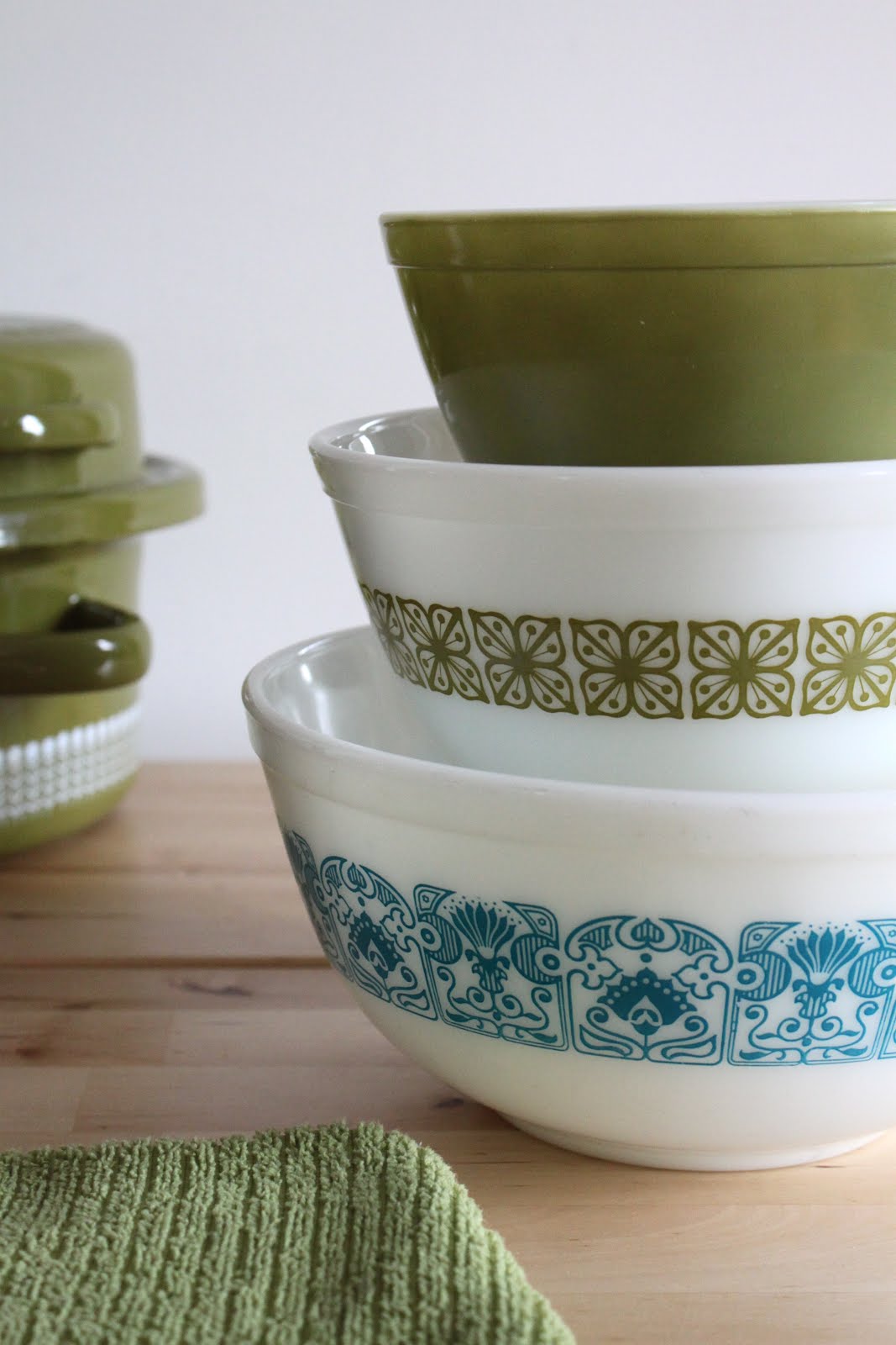
It did give us slight pause as to what to do with them though, because they weren't suitable inventory for the Etsy shop and up until this point our kitchen has always been a shade of chartreuse, apple-green (always. Since the time I moved out of the college dorms and had a kitchen, and every kitchen we've had together since). Then of course, we added the turquoise/aqua blue because you don't look a gift-horse in the mouth and then complain about the color. Moot point anyway because green Le Creuset wasn't even offered in the early years.


So it has now been decided - our kitchen colors are turquoise/aqua blue, chartreuse/apple green and bright orange! Drum roll.....


What do you think?

I don't even want to ask how much you paid for them!!! Did you know that on the design colour wheel turquoise and orange are complimentary opposites? That's why they look so fab together!! Like you I don't really love orange for its own sake but when I put all my orange Cousances and Le Creuset (a lot) together with my aqua Le Creuset and Pyrex it looks fab!
ReplyDelete